Blog

38 posts 2009 16 posts 2010 50 posts 2011 28 posts 2012 15 posts 2013 7 posts 2014 10 posts 2015 5 posts 2016 4 posts 2017 7 posts 2018 2 posts 2019 17 posts 2020 7 posts 2021 7 posts 2022 11 posts 2023 7 posts 2024 7 posts 2025 5 posts 2026

The best dark mode toggle is probably none

13 min read Report broken page

My post on two-state dark mode toggles sparked a lot of discussion about the optimal dark mode toggle design. But should you have a (persistent) dark mode toggle at all? I have since been convinced that for most websites, the answer is no.

About a month ago, I wrote an article recommending that if you are going to have an always visible control for switching between light and dark mode, it should be a two-state toggle that alternates between system and whatever the current opposite of system is, not a tri-state one (system, light, dark). If you are forced to include such a control (say, someone is pointing a gun at you and shouting “code dammit! now!”), I stand by that recommendation: use two states, as described in the article.

But the article explicitly doesn’t answer the question “should you have one at all?”. I was much more neutral on this at the time of writing. I am now firmly in the “no” camp. More on that below.

The two-state toggle design proposed in my article can actually express all three data model states.

What I didn’t mention was that I had been meaning to write this article for years, but had been putting it off. What finally pushed me to write it 1Unless otherwise noted, this refers to a permanently visible toggle in the header or (rarely) footer, not a theme setting in a separate settings panel. was that Bramus argued that some Modern Web Guidance I had written on this was incorrect. He assumed it was an oversight, that I simply hadn’t thought of all the implications. On the contrary, my recommendation had been the result of some very careful consideration, combined with my HCI background. Surely, if I explained my reasoning well, he would see it!

I tried to convince him through discussion (in person, as we were both in Berlin at the time) to no avail. My conclusion was that I must be doing a poor job explaining my reasoning, and that a blog post was in order to explain it properly. Surely, after that he would be convinced!

And thus, one of my most successful blog posts was born.

Reactions

This article really made the rounds. It was shared by hundreds of folks, including people I really respect, such as:

and many others. A lot more who hearted it.

Some of the quotes really made me blush ☺️. Here is a small selection:

I wasn't sold on this until I got to the implementation. It's so smart I'm probably gonna spend my day redesigning at least one or two of the theme toggles I've built.

[image or embed]

— Josh Collinsworth (@collinsworth.dev) August 6, 2026 at 4:30 PM

This is one of the best articles I've seen about the difference between letting the underlying settings dictate the structure of your UI, and thinking about what actually makes sense to your users. Really, really insightful, and definitely worth ten minutes of your time.

[image or embed]

— Dylan Beattie (@dylanbeatt.ie) August 6, 2026 at 4:43 PM

Once upon a time web developers regularly wrote blog posts about UX design that were this good. Thank you to @lea.verou.me for keeping the art alive.

[image or embed]

— Sam Littlefair (@littlefair.ca) August 6, 2026 at 6:19 PM

OK, I'm persuaded. For a toggle in the header or footer, a toggle between 'system colour scheme' ↔️ 'the opposite' is better than system ↔️ light ↔️ dark.

Lea is a master of user experience.

[image or embed]

— Josh Tumath (@joshtumath.uk) August 7, 2026 at 2:19 AM

This is a great post to read, lots of useful UX and usability thoughts. I like this approach.

[image or embed]

— Ahmad Shadeed (@ishadeed.com) August 7, 2026 at 11:09 AM

Really, really appreciate the deep thinking about the user's _actual_ needs and intentions, irrespective of conventions and commonalities, in this brilliant piece. 👌

[image or embed]

— sylvia (@svillegas.com) August 12, 2026 at 9:12 PM

Articles were written, for and against it. This is a small sample (I couldn’t find most of them):

Unfortunately, I failed to convince Bramus, who two weeks later wrote a blog post of his own 😢

Bramus’ objections

Bramus’s central objection to the two-state toggle is this:

Consider this scenario:

  1. The user’s OS is set to auto-switch Light/Dark based on the time of day.
  2. They visit a website during the day, so they see the Light theme.
  3. Using the site’s two-state control, they try out the Dark theme. They decide they don’t like it, so they revert it back to Light.
  4. They visit the site again at night.

Because the two-state toggle maps one of its values back to “System” behind the scenes, the site is now dark, although they explicitly chose light the last time they interacted with the control. You may now expect an incoming bug report for the control not properly working …

His reasoning is that a tri-state control sidesteps this by letting users pin light or dark explicitly at all times, which he also considers clearer overall, since all three options are always visible.

An easily-misread framing: auto-switching by time of day works fine

In both of his posts, Bramus initially frames the disagreement as “this will not work for users that have their system set to automatically switch to dark mode at night”, which is false: it will work just fine. The control covers all three intents with a single click. Not a single click per session — a single click, ever. The variable is around when that click happens. In fact, I dedicated a whole section to this exact scenario in the original article, which he acknowledges but says he’s “not buying it”.

He does later explain what he sees as broken in more detail, but since most people do not read very carefully, there were a couple people who agreed thinking the two-state toggle I was proposing is somehow broken for auto-switching systems.

His poll asks the wrong population the wrong question

Bramus asked developers which control they build, then used the tally as evidence for which control is usable!

Those are different questions. Developer preference is confounded with convention and implementation convenience. If asking developers what they build gave us data on what UI is most usable, we wouldn’t need user testing, ever 😅

We optimize UIs around user goals, not around developer preferences. In fact, more often than not there is a tension between what is easiest to build and what is optimal for usability, because usability is all about abstracting the underlying model (which is closer to the machine), and exposing a model that is closer to how the user thinks.

“Local feedback” doesn’t solve the gulf of evaluation

Responding to the objection that two of the three options produce the same visual result, Bramus writes that

“the selected option does change so there is local visual feedback.”

Sure, the button highlights, and that’s better than if nothing happened at all. But the button is the means, not the end. The user clicked it to change the page, not the button!

When the control changes and the page doesn’t, the user acted and the world didn’t respond — that’s Norman’s gulf of evaluation. Widget feedback with an unchanged outcome is the failure, not a mitigation of it. It’s also why NN/g’s toggle guidelines insist a toggle has an immediate, visible effect.

Implementation simplicity != cognitive load

Bramus says:

“there is nothing complex about a tri-state control” […] it’s “the Dumbest Approach™ one could possibly take.”

Yes, it is — that was exactly my point when I wrote that tri-state toggles are implementation-driven UI. The actual user goal in the moment is not abstract (“system” is a variable, not a value), it is concrete (light or dark). Using a tri-state control involves a mental translation from the three states to the actual user goal. It’s of course very short, almost imperceptible to users — but avoiding this type of unnecessary mental processing was exactly the point of Don’t Make Me Think — which ironically Bramus cites to support his argument.

“Clarity over brevity” is one of these platitudes that everyone agrees with 2This is about users. Yes, the developers of the site may have a goal of testing the theme, but we optimize UIs for being used, not getting debugged. , but people use it to support even entirely contradictory positions. Whenever I see one of these, my tendency is to prod deeper; clarity about what? Clarity about the implementation’s state machine is not clarity about outcome. The tri-state is optimized for people who already hold the system model — which is, again, developers.

The failure scenario is rare, and recovery is cheap

Bramus’ central objection is that with a two-state control, forcing a mode “shouldn’t be dependent on the time of the day.” The scenario he gives requires OS auto-switching, plus toggling and reverting within a session, plus revisiting after the switch, plus remembering the earlier interaction.

Usability problems are prioritized by frequency × impact × persistence, and this scenario scores low on all three. The tri-state, by contrast, taxes every interaction with a state most users never need. Optimizing the common path over a rare, cheaply recoverable edge case is not an antipattern, it’s precisely how usability engineering is supposed to work!

“Once a user has interacted with a control, they have mentally set it to the specific state”

People don’t remember settings on sites they rarely visit. For them, a site that tracks the OS matches expectations; a stale override fighting the OS is the actual surprise (“why is this site light at night?”). And in practice no user devotes nearly as many cycles contemplating why the theme of a website they visited to accomplish a task matches or doesn’t match their OS, at most they just toggle and move on. It’s not even System 2 thinking. If there is a recurring problem, sure, they may think about it more consciously, a few may even report a bug. But something that’s fixed with a single click, in a very obvious way? It might not even surface to the conscious mind.

Bramus himself admits that his scenario is purely theoretical; he has never experienced it himself nor seen anyone else experience it.

Once you’ve spent a lot of time and effort on something, you overestimate how much it matters to everyone else. This is true not just in UI design, but in all aspects of life, from any areas you’re an expert in to even your kids 4Most parents hugely overestimate how many people are interested in kidnapping their kids. In reality they struggle to even find someone to look after them for an evening, let alone take them forever 😅 . Developers have spent days on this control, users will spend half a second at most. It’s the IKEA effect meeting the false-consensus effect: you overvalue what you built, then assume users do too.

Alternative designs

My favorite part of the debate was that it spawned a number of alternative designs.

Some people were divided. They agreed with the reasoning, but still thought a tri-state toggle added clarity. So naturally, they did what UI designers do best: they designed, and the results are quite clever.

Others took a different, hilarious tack on the problem, and attempted to imagine the worst possible dark mode toggles.

Lawful Good 😇

Vale’s 3-in-2 toggle

The alternative that made the rounds most is Vale’s innovative design:

System Light Dark

The core premise is quite clever: Three states with the real estate of two icons (33% saving over the typical tri-state control — though still double that of a two-state control), and clarity about whether you’re selecting system or pinning a mode that happens to coincide with your current system setting.

However:

  • As Vale themselves admit, some users did not realize they could revert the option they had selected, simply because that’s not a common interaction pattern. Vale does say this was a minority of users, and that it was “immediately understood by the great majority of people [they] tested it with”, however I have doubts on whether this would hold true in the wild, when you haven’t already primed users to pay extra attention to the dark mode toggle.
  • Vale claims that “It only takes up the space of a two-state toggle”, but that’s not true. A two-state dark mode toggle only needs the real estate of one icon, not two. It’s possible to implement one that shows both icons simultaneously, but that’s rare.
  • In its default state, nothing communicates “system”. It is two icons with no indication of which is currently active. We understand that it’s a dark mode toggle, because it’s presented in isolation, in the context of an article about dark mode toggles. But used on an actual website, I wouldn’t be surprised if users had no idea how to use it and only figured it out by trial and error. Subtly highlighting what System currently resolves to could help here, but then we’re back distinguishing whether “light” means “System (light)” or “Light, always”.

But most importantly, this is adding significant implementation and UI complexity for something that the vast majority of users don’t devote nearly as much thought to as we think they do. In my opinion, this is admirable effort that is ultimately solving a non-problem.

Toni’s undoable two-state toggle

This is also quite interesting:

i feel this is a good trade off if you want to give users the most control, even though i see your point that this is possibly too niche of an edge case to justify.

did i do the UX version of premature optimization, or does this just suck too?

[image or embed]

— toni / link (@sarcevic.dev) August 9, 2026 at 2:49 AM

It’s a two-state toggle that pins light/dark when interacted with, but provides a clear button. This is similar to Bramus’ idea but with more polish.

As I said on bsky, I don’t think this particular design works because:

  • Spacing makes it look like these are separate controls, not one clearing the other’s selection
  • The clear button has nothing associating it with the color scheme toggle (not proximity, nor its icon).

But none of these are core to the idea, and could be fixed with a little more UI design massaging. If someone really wanted to have three states visible at all times, a reworked version of this would probably be the best way (and can be designed to occupy similar screen real estate as a two-state toggle).

Should anyone spend the time to do this rework? Like I wrote in the previous section, my opinion is that these efforts are pouring a great amount of brilliant creative energy into solving a non-problem, so I would not recommend it.

Chaotic Evil 😈

The Big Dark Mode Toggle Debate™ raged on for weeks, and I think my favorite part of it was the side thread of people taking the piss and coming up with the worst possible dark mode toggle designs imaginable 😅, possibly as a tribute or reprise of The Worst volume control UI.

I reject your two-state toggle and submit my own 4-state toggle. Pray that I do not increase it to 5.

[image or embed]

— Michael Ficarra (@michael.ficarra.me) August 6, 2026 at 5:02 PM


[image or embed]

— Michael Ficarra (@michael.ficarra.me) August 6, 2026 at 5:13 PM


[image or embed]

— Michael Ficarra (@michael.ficarra.me) August 6, 2026 at 5:18 PM

Of course, I had to participate:

Oh but why stop there? 🤣

[image or embed]

— Lea Verou, PhD (@lea.verou.me) August 6, 2026 at 5:25 PM

I actually strive for perfect clarity with my color theme pickers.

codepen.io/editor/chris

[image or embed]

— Chris Coyier (@chriscoyier.net) August 23, 2026 at 5:51 PM

Did anyone already mention "Dark mode with spotLight"? No!? That's the only valid way.

Demo: codepen.io/t_afif/pen/Y… via @codepen.io

Debating about toggles? Well, I don't understand …

[image or embed]

— CSS by T. Afif (@css-only.dev) August 24, 2026 at 1:36 PM

Anything below 4 is unacceptable. right @svenning.io

[image or embed]

— Andreas Møller (@andreasmoller.dk) August 22, 2026 at 12:05 PM

This may be my favorite:

The current debate between 2 vs 3 state theme switchers is ridiculous. Everyone knows that the right answer is 100

#css #a11y

[image or embed]

— Andreas Møller (@andreasmoller.dk) August 22, 2026 at 11:59 AM

Two-state, tri-state, four-state...why should we concern ourselves with this anyway? I say users should not get this for free at all; therefore, I introduced a new mode in this article called capitalism mode ✅

codepen.io/editor/sunka

#css

[image or embed]

— Sunkanmi Fafowora (@sunkanmifafowora.bsky.social) August 26, 2026 at 1:33 AM

Could the best dark mode toggle be …none?

However, my biggest insight from all of this is that while I stand by my original recommendation that in most cases, if you are going to have a dark mode toggle that is visible at all times, it should only have two states (system and opposite), I now think that for the vast majority of websites, you should not have such a toggle at all.

Follow system as the default, and if need be have a separate settings panel (even if it’s not actually implemented as a separate page but just an overlay) and put it there. It simply doesn’t warrant permanent screen real estate for the vast majority of users.

The eye-opening moment was when I sent my post to a colleague who is also an HCI PhD, to get their feedback on whether my reasoning was sound, or whether I had any blind spots. For background, this was someone who was much less immersed in the technical weeds of the Web — their work centers more around humans than around deep technical details.

I expected either agreement or constructive criticism, but what I got was much more eye-opening: It turned out that they had no idea what control the article was talking about! Folks, …they had never seen a dark mode toggle!5or — perhaps more likely — never paid attention to one

And then it dawned on me: all these persistent dark mode toggles I had seen, literally all of them have been on developer-facing sites!

I could not think of a single well-known consumer-facing site with a persistent dark mode toggle. All consumer-facing websites that supported this functionality displayed it in a separate settings panel (which is a different use case). Even those which people spend hours a day using, like Gmail, Facebook, BlueSky, etc. None of them see this as a use case that deserves precious header real estate.
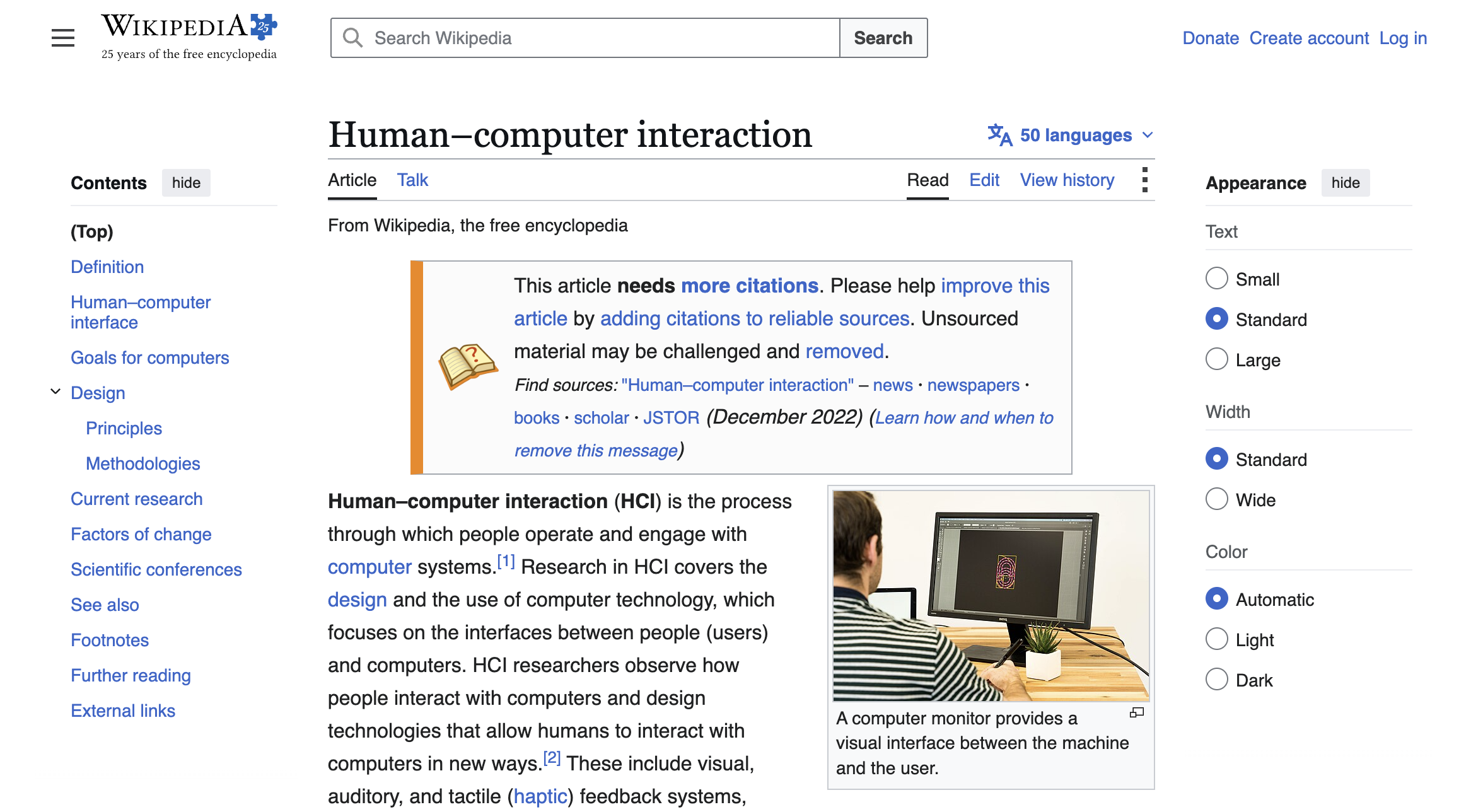
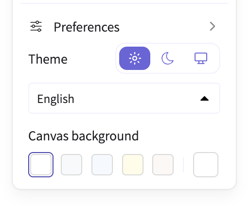
Wikipedia with the settings panel expanded

Wikipedia does show this sidebar by default on large enough viewports, but this is not an exception — just an auto-expanded settings panel.

Now, this alone is not evidence that dark mode toggles are a bad idea. A pattern can be widespread and still suffer from poor usability. And every UX innovation started off not being popular, so the reverse doesn’t hold either: a pattern can be unpopular and still be good. But in this case, I think they’re right. It suddenly all made sense to me: this doesn’t matter nearly as much to the average user as it does to us developers.

To be clear: “always light/dark, even against the OS” is a legitimate intent! But it is also a relatively rare one, and rare intents belong behind progressive disclosure — a settings surface — not in the one control every visitor sees.

In a textbook case of false-consensus bias, we have been so focused on our debugging needs that we convinced ourselves this is top of mind for the average user.

When is a persistent dark mode toggle a good idea?

A corollary from the reasoning above is that a dark mode toggle is a good idea when the website is developer-facing or developer-adjacent (e.g. a site for designers).

Experimental validation

Usability is a property of user outcomes, and no users were observed in any of this. Even my own article was derived from first principles and my experience observing users, but no actual observations of users interacting with dark mode toggles were made.

Per the previous section, I’m not convinced this is a problem worth solving. That said, if we do want to solve it, the best answer is obviously to get data from real user interactions.

However, there is a caveat here: qualitative user testing6The kind where you get a few users and observe them using the UI to accomplish a task — i.e. what most people refer to as just “user testing” is less useful for infrequent microinteractions like this one.

Think about it: how would you design a meaningful qualitative experiment? At best, each participant would only interact with the toggle once. Most wouldn’t click it at all, unless the experiment was designed to show a website where the OS default theme is awful, which generalizes poorly.

Another easy bias in a controlled experiment is that it’s easy to bias the results by drawing attention to things that users would otherwise pay much less attention to. E.g. Vale wrote that the 3-in-2 switch was “intuitive and immediately understood by the great majority of people [they’ve] tested it with”. I strongly suspect these users were aware that something around dark mode toggles was being tested, and were paying a lot more attention to the control than they organically would.

I think the best way to get data for something like this is to record how users actually interact with the control, at scale, then analyze the data quantitatively. The experiment could involve different toggle designs as separate conditions.

Then, we could look at the data to answer questions like:

  • How frequently do people interact with the control meaningfully (i.e. ending up with a different selection)? (to see if it’s worth permanent screen real estate)
  • On a tri-state control, how frequently do users actually select the option that matches system but isn’t system? (to see if you actually need three states)
  • For mouse users, how much time passes between hovering the control and making a final selection for each condition and how many clicks does it involve? (as a proxy for cognitive load)
  • etc

By select above, I’m not referring to clicking, but the actual, final selection, to avoid noise from people playing with the control just to see what it does.

The big picture: Question the problem first

It is easy to get deep into a rabbit hole of trying our hardest to solve a problem that shouldn’t exist in the first place.

Especially for those of us with an engineering background, problem-solving comes naturally and it’s very hard to resist a challenging problem.

I’ve seen this happen repeatedly in many types of technical debates. It’s very common in standards groups as well: someone proposes a feature and the group starts debating the details before deciding whether the feature should exist at all.

Before any significant problem-solving task, it’s always good practice to step back and ask ourselves “is this a real problem worth solving?”.

You’d be surprised how often the answer is no.


6 footnotes
  1. during a CSS WG meeting where I was presenting several topics no less! ↩︎

  2. It’s right up there with “simplicity”. I have seen developers happily shovel complexity downstream to users using “simplicity” as the justification. ↩︎

  3. I’m not talking about you Bob! ↩︎

  4. Most parents hugely overestimate how many people are interested in kidnapping their kids. In reality they struggle to even find someone to look after them for an evening, let alone take them forever 😅 ↩︎

  5. or — perhaps more likely — never paid attention to one ↩︎

  6. The kind where you get a few users and observe them using the UI to accomplish a task — i.e. what most people refer to as just “user testing” ↩︎

Dark mode toggles: two states are enough

10 min read Report broken page

Yes, the underlying model must have three states, but one is always irrelevant to the actual user goal. Users do not seek out solutions to problems they don’t currently have. A lot of the hate towards two-state toggles is based on poor implementations.

A good two-state toggle can actually express all three data model states.

Until recently, if you looked at most websites with a theme toggle1Unless otherwise noted, this refers to a permanently visible toggle in the header or (rarely) footer, not a theme setting in a separate settings panel. , you’d find three options: Light, Dark, and System.

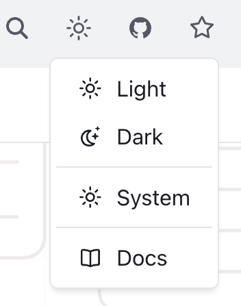
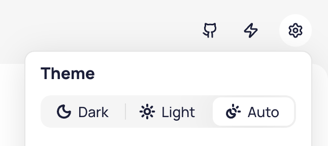
Tailwind Red Hat Design System Ant Web Awesome Excalidraw Taiga Astro Hero UI

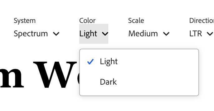
Examples of tri-state dark mode toggles. In (LTR) reading direction: Tailwind, Red Hat Design System, Ant Design, Web Awesome, Excalidraw, Taiga, Astro, Hero UI.

Thankfully, these days the trend has shifted towards a simpler two-state toggle, but tri-state ones are still incredibly common.

Vitepress Material Spectrum Radix Shadcn

Examples of two-state dark mode toggles. In (LTR) reading direction: Vitepress, Material Design, Adobe Spectrum, Radix, ShadCN.

The rationale sounds plausible: “System” is a different intent than “Light” or “Dark”! One is a policy (whatever my OS says, do that) The other is a value (dark, forever, I don’t care what my OS says.) Surely, users should be able to express that intent!

Except, real users don’t generally seek out dark mode toggles to express intent for things to stay as they are, they seek them out when things need to change.

Think of the user goal when browsing a website (as opposed to a separate Settings page, where three states are fine). E.g. on a documentation site, they may be there to look something up. On a landing page, they may be trying to evaluate whether the product is suitable for their needs.
On a media site, they may be there to read the news.
On a graphics app, they want to draw something.

One thing is for certain: tweaking the theme is not their primary goal 2This is about users. Yes, the developers of the site may have a goal of testing the theme, but we optimize UIs for being used, not getting debugged. . To get in the mindset of tweaking the theme, something needs to be off. When things look right, users just move on with their actual goal instead of thinking about the theme.

The tri-state control is solving a largely imaginary user goal that is extremely rare among real users, and does not justify the additional complication and UX friction of a three-state toggle.

Worse, it forces the user to decide between choices that produce no visible difference, breaking the principle of feedback.

Yes, tri-state toggles are common. That doesn’t make them good. This essay explains why, and how to do better.

This article is about how to implement a good dark mode toggle, if you have already decided you need one. It does not prescribe whether one is necessary at all. If you decide to simply default to the system preference and not offer a toggle, I think that is a perfectly valid choice. And yes, I agree that eventually browsers should provide this as part of their chrome, instead of every website having to implement it themselves, but we’re not there yet.


2 footnotes
  1. Unless otherwise noted, this refers to a permanently visible toggle in the header or (rarely) footer, not a theme setting in a separate settings panel. ↩︎

  2. This is about users. Yes, the developers of the site may have a goal of testing the theme, but we optimize UIs for being used, not getting debugged. ↩︎

Continue reading


In defense of polyfills

13 min read Report broken page

A highly influential spec editor expressed the opinion that polyfilling is harmful. I beg to differ.

If you’re a web developer, you may find the title baffling. “Polyfills need defending? Who’s against them?!” you might ask.

Two weeks ago, I’d be in the same boat.

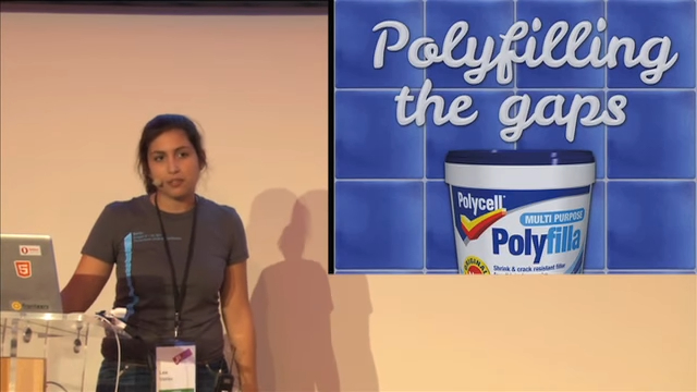
Polyfills and I go way back. I dug up a JSConf EU talk of mine from 2011 on exactly this topic.

YouTube still from that talk
Trying not to think about how young I look here 😅

One of the few opinions I have held strongly over the years is that polyfills are a net positive for the Web, and the good outweighs the rare failure cases where polyfills became too popular, too soon, and restricted the design space for the native API.

As with most things in life, it’s all about the cost-benefit. We don’t stop flying planes because crashes happen. We do a post-mortem and figure out how we can prevent the same accident from happening again. And crucially, the point of a post-mortem is to find the root cause — not to ground the entire fleet.

Don’t get me wrong, concerns about polyfills are well-intentioned. They come from implementors and standards folks who want to preserve the design flexibility to build the best API surface possible — a goal I share deeply. Being both a spec editor and a library author, striking that balance is something I navigate all the time.

Still, I was under the impression that seeing polyfills as a net positive was the consensus view of the web standards community as a whole. That while we may not have consensus on the specific tradeoffs or solutions, we see polyfilling as a good thing and we generally do want web platform features to be polyfillable.

So, you can imagine my surprise when in a recent WHATWG meeting where I presented a proposal for extending mutation observers to observe shadow root attachment, Anne van Kesteren expressed the view that polyfilling is harmful.

Say what now?!

It’s important to note that Anne is not some rando. He is the main active editor of most WHATWG specs (HTML, DOM, Fetch, import maps, etc.), a WebKit engineer at Apple, and has tremendous overall influence on the direction of the Web platform.

I had to find out if Anne’s comment reflected broader committee consensus, so I brought the topic up in the WHATWG Matrix and asked some folks privately.

Thankfully, it became clear that no, Anne’s comment did not reflect broader consensus (😮‍💨), but some of the views expressed about polyfills were more ambivalent than I’d have expected.

As I said, these concerns are well-intentioned — but I believe they are generally misplaced. Most fail to consider the system holistically, and especially the human factors that drive developer behavior.

Let me explain.

It’s not the polyfills

Authors want to use native behavior when it exists, without breakage when it doesn’t. That’s the crux of it. That’s what restricts design flexibility.

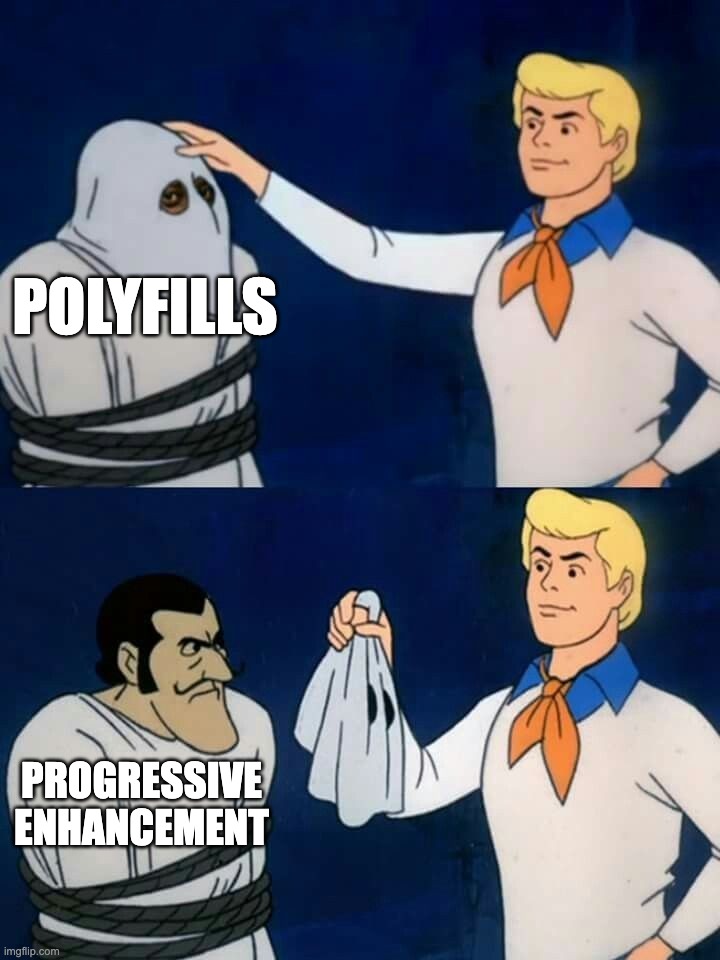
Scooby do mask reveal meme with the first panel reading “Polyfills” and the second (revealed) reading “Progressive Enhancement”

Whenever this happens too early, by too many people, you can have a problem. It doesn’t matter whether the code using it is a polyfill, a fallback, “progressive enhancement” or “graceful degradation”.

Fundamentally, every pattern that uses the native feature when it exists and a userland implementation (or even nothing) when it doesn’t risks breakage if the feature changes in a way that is incompatible with that usage.

This includes:

  • Using CSS properties for progressive enhancement, accepting that they won’t work everywhere
  • CSS fallbacks via the cascade or @supports
  • Conditional imports after feature detection
  • Using a modern HTML element, with a script that converts it to (or wraps it with) a web component if not supported
  • Build tools that include fallbacks alongside the native feature
  • JS let foo = nativeThing?.() ?? fallbackThing()
  • etc etc

In all of these cases, if the native API were to change in a way incompatible with the fallback usage, stuff could break.

Eliminating polyfills does not eliminate the need for them.

The benefit of polyfills over the techniques above is author-facing: polyfills are portable, maintainable, and typically more correct than ad-hoc fallbacks.

When a bug is identified in a polyfill, it can be fixed centrally. When a bug is identified in an ad-hoc fallback strategy, good luck finding all the callsites and fixing them.

Bottom line: eliminating polyfills does not eliminate the need for them and all other avenues of satisfying that need are measurably worse.

Polyfills decouple API design from implementation

Standardized APIs have intrinsic value, independently of browser implementations.

We think of polyfills as a toggle: use a polyfill, leave it in there, and later when all browsers implement the feature natively, it gets removed.

This misses out on one of the biggest benefits of polyfills: decoupling API design from implementation.

If a userland library isn’t working well, you must weigh the tradeoffs of refactoring your codebase to use a different library, and educating your team about the new library.

With a polyfill, the API itself is not within the purview of the polyfill. The polyfill supplies only implementation, while the API is externally decided by the standards. Thus, swapping a misbehaving polyfill for another has near-zero cost.

The benefits of API standardization are far greater when we consider the broader ecosystem. A dependency isn’t aware what your userland implementation may be for certain functionality. Either it needs to provide a way to pass it via configuration (expanding its API surface), or it needs to implement its own version of the functionality, which may be incompatible with that of the host.

Standardized APIs are the town square of the Web, uniting all consumers (developers, agents, tooling, etc) around a shared vocabulary.

For example, suppose we’re using:

  • a data binding framework that synchronizes JS data with form controls
  • a library that reads form control values and stores them in localStorage until the form is submitted
  • a custom command invoker for copying the value of an arbitrary form control to the clipboard

As long as these are implemented in an element-agnostic way, reading element.value1Unless otherwise noted, this refers to a permanently visible toggle in the header or (rarely) footer, not a theme setting in a separate settings panel. and listening to input and change events, they will work with any form control that implements the same API, whether it’s a native HTML element or a custom element, allowing for loose coupling.

But without this standardized API, we need to specify how every custom element expresses its data and what event(s) it uses to notify for changes to each and every one of these libraries. This is user effort on the magnitude of O(M × N) on the number of consumers and producers that must know about each other. Standardized APIs collapse it to O(1).

Are separate namespaces the solution?

From the same WHATWG discussion:

Anne: I would much rather people write a library that demonstrates the need for something as opposed to something that attempts to mimic the exact API shape of a proposal while simultaneously trampling all over our design flexibility.

Anne: You want to enable people using the amount element? Fine, but call it [something]-amount.

Stephen: I see “library that implements some feature” and “polyfill” as synonymous, but I can also see that fails to capture everything.

Anne: When I hear polyfill I think specifically of things that attempt to occupy the exact same API space and tend to cause issues, such as we had recently with Scoped Custom Element Registries. We ended up with a much worse standardized API because of that.

The topic of polyfilling often comes up in discussions about CSS and HTML polyfilling, which are currently much harder to polyfill than JS features.

Many people are of the opinion that the solution is to have a separate namespace for polyfills, so they cannot conflict with native implementations. For example, instead of polyfilling <amount>, you’d create a web component that polyfills <polyfill-amount>. Instead of polyfilling the CSS property border-shape, you’d write a polyfill that makes --border-shape work the same way.

At first glance, this seems ideal: the benefits of polyfilling without the risk of syntax lock-in! But we’ve tried it before.

Who remembers vendor prefixes?

Their core premise was exactly the same: if we experiment in a separate namespace, the native implementation can change without breaking any existing deployed experiments!

But remember, humans want to use the native feature when it’s there. And they don’t want to go back and edit their code when that happens. So what do they do? They use both! Even if the native feature has no implementations yet, pre-emptively.

We know exactly how this plays out, because it already has: stylesheets everywhere declared -webkit-border-radius with an unprefixed border-radius right below it — before any browser shipped the unprefixed property, and before its syntax was final.

So authors get worse DX, and web standards get no more design flexibility. Everybody loses.

Is dropping feature detection the solution?

As another attempt to mitigate the issues, some have started recommending polyfills that skip feature detection entirely and always use the fallback implementation, even when the native feature exists.

This is extremely wasteful. Polyfills add weight, are typically slower than native implementations, less accessible, less i18nclusive, and rarely handle edge cases. As their name implies, they are meant to temporarily cover a gap. They were never meant to be a long-term solution. The whole point is planned obsolescence: they eventually become dormant, even in a codebase that is no longer actively maintained. Feature detection and conditional loading are essential for that to work.

Authors accept these costs because they are temporary: every browser update quietly moves more of their users onto the native implementation, until the polyfill fades into a no-op. Remove feature detection, and the costs become permanent. Every user pays the download forever, and no user ever gets the native implementation’s performance, accessibility, or i18n — even when it’s sitting right there in their browser.

This approach does preserve the advantages of a standardized API, but at what cost? It trades away real, tangible benefits, felt by every user of the Web, to prevent a rare, largely theoretical risk. Every economist would be pulling their hair out at this cost-benefit!

Are ponyfills the solution?

Ponyfills, as originally envisioned by Sindre Sorhus, are basically userland libraries that closely track the native API, but do not modify the global environment and may intentionally diverge from the spec.

They are often suggested as a better alternative to polyfills.

For example, a polyfill for RegExp.escape() might look like this:

if (!RegExp.escape) {
	RegExp.escape = function (s) {
		return s.replace(/[.*+?^${}()|[\]\\]/g, '\\$&');
	};
}

Whereas a ponyfill might be:

export function regexpEscape(value) {
	return value.replace(/[.*+?^${}()|[\]\\]/g, '\\$&');
}

Note that this does not use the native implementation at all. It is not meant to be removed later. Its link to the native API is purely psychological.

I can see ponyfills being helpful for iterating on and getting feedback on an API while the standard is still being developed, or even to motivate a new proposal. But then again, so are userland libraries.

But for a mature feature, that has shipped in at least one browser, their appeal is much weaker.

They lack all strengths of polyfills:

  • They don’t use the native implementation, even when it exists.
  • They cannot be removed without refactoring
  • Without a standardized API, a ponyfill cannot be swapped for another without further refactoring.
  • They introduce a new userland dependency that needs to be evaluated, learned, documented, and maintained, just the same as if no standard existed at all.

IMO ponyfills are just userland libraries with better marketing.

Even their only advantage, not modifying the global environment and thus not trampling on the spec, is typically negated by actual usage: as a sort of …deconstructed polyfill.

See this post where the author is using a ponyfill for Number.MAX_SAFE_INTEGER as part of a makeshift polyfill:

const MAX_SAFE_INTEGER = Number.MAX_SAFE_INTEGER || require('number-max-safe-integer');

This is the norm, not some lone author failing to grok the concept of ponyfills. In fact, many people would call something like this a ponyfill as well:

export function regexpEscape(value) {
	if (RegExp.escape) {
		return RegExp.escape(value);
	}

return value.replace(/[.*+?^()|[\]]/g,&'); }

This combines the disadvantages of both approaches, while getting you the benefits of neither!

In the end, the usage hasn’t changed, because the human need hasn’t changed.

Do polyfills discourage native implementations?

Stephen: […] polyfills can reduce the need for all browsers to implement something in a timely fashion.

Do they?

Yes, the existence of high-quality, lightweight polyfills can reduce the urgency for browsers to be the last to implement. But even then, the pressure never drops to zero: polyfills are slower and heavier than native implementations, and it’s the lagging browser’s own users who feel the difference. Without polyfills, authors wouldn’t use the feature at all — every browser would be equally fast at not supporting it, and the laggard could drag its feet indefinitely, consequence-free.

More importantly though, being last is not what’s critical for the Web’s evolution.

Check out my specs page. What is the average time from spec to first implementation, from that to the next, and from that to the last?

Milestone Proposals Mean time Median time
Spec → first implementation 9 1y 9m 7m 1d
First → second implementation 10 5m 10d 3m 5d
Second → last implementation 8 6m 14d 4m

The first implementation is the hardest.

A Web platform without polyfills would be a stagnant platform.

What is the motivation for a browser to be the first to implement if authors cannot use the feature until all others implement it as well? Would you sink millions of dollars of engineering time into something your competitors can render moot, by means of simply …doing nothing?

We cannot A/B test reality, so this is purely a thought experiment, but I think if polyfills, fallbacks, and progressive enhancement suddenly disappeared, it would slightly increase motivation for those shipping last, but would significantly reduce motivation for shipping first. And since nobody can be last without someone else being first, a Web platform without polyfills would be a stagnant platform.

Additionally, often the biggest blocker in getting browsers to implement new features is demonstrating developer demand. A popular polyfill does that beautifully.

In fact, there is already plenty of precedent that if a feature cannot be used conditionally, browsers are reluctant to implement it. For example, decorators consistently top the list of missing JS features, but because JS syntax cannot be reasonably polyfilled, they are nontrivial to implement, and they are so widely used via transpilers, no browser has shipped them. “Let them use build tools” seems to be the general unspoken consensus.

Polyfills only get in the way when the standards process fails

I did some digging; Anne’s view traces back to a 2025 whatwg/html discussion where an API around scoped custom element registries had to be renamed due to conflicts with two existing polyfills that implemented a different behavior (emphasis mine):

We have prototyped a solution that seems to work and preserves the API pretty much as-is (still unfortunate though; please stop polyfilling and deploying polyfills)

To be fair, the underlying concern is real, so let me steelman it. Once a library squatting a proposed API name becomes popular enough, its exact behavior — bugs and all — becomes a web compat constraint. Standards groups then face a choice between adopting the library’s semantics or breaking deployed sites, and sometimes the only way out is renaming or redesigning the native feature, which is what happened here. That is a real cost, borne by the very people designing the platform.

But let’s be clear: none of the libraries that caused this problem was actually a polyfill, since there was no standardized API to polyfill.

At worst, they were naughty userland libraries, much like MooTools’ Array.prototype.flatten() that caused the smooshgate fiasco. At best, they were speculative polyfills (aka prollyfills) — an imagined API occupying the same namespace as a future builtin so authors can experiment with an emerging standard. Prollyfills are (rightly) more controversial, and not what this post is about.

Assigning blame to polyfills is like blaming car accidents on the ambulances that show up on the scene.

But when you examine the failure cases more closely, they all have something in common: In every single one, standards groups and/or browsers failed to react to a strong user need in a timely fashion.

Assigning blame to polyfills is like blaming car accidents on the ambulances that show up on the scene. A popular polyfill is a consequence. Polyfills should never become too popular in the first place: the feature should be widely implemented by then!

If a polyfill (or prollyfill) becomes so popular that it can create a compat problem, that is a symptom that a pervasive user need went unmet for too long. Whether it’s a polyfill or a prollyfill only changes which entity failed to react in time.

And even in the failure cases, consider the counterfactual. When a prollyfill constrains the design space, the damage is a worse name or a compromised API shape — bounded, and known before shipping. When an API ships without real-world validation, the damage is unbounded, and only discovered once the design is frozen into the platform by web compat. Remember AppCache? It shipped natively with no userland trial run, turned out to be fundamentally wrong, and took a decade to deprecate and replace with Service Workers. A prollyfill that surfaces design problems while the spec can still change is far cheaper than deploying the wrong API.

Developers don’t use polyfills in vain. Every dependency has a cost. If we see a polyfill becoming wildly popular, that should be a signal for urgent prioritization, not a reason to complain that authors are naughty.

Instead of blaming the user (“please stop polyfilling and deploying polyfills”), we should be doing a post-mortem on how to avoid such process failures in the future.

“If one user gets it wrong, it might be them. If two users get it wrong, it’s definitely you” — Ancient UX proverb2This is about users. Yes, the developers of the site may have a goal of testing the theme, but we optimize UIs for being used, not getting debugged.

When web platform design follows the priority of constituencies, and prioritizes end-user and author needs above implementors and standards authors, the failure cases are practically nonexistent, even when polyfills jump the gun and ship too early.

The WHATWG process invites these failures

Why did scoped registries take so long to ship? The web components community had been asking for years!

Part of this is that the WHATWG process is designed to be reactive rather than proactive. Even if there is a strong, demonstrated author need, WHATWG will refuse to flesh out a feature until at least two implementors express interest in implementing it. “needs implementer interest” is where so many good ideas go to die.

This made sense when WHATWG was founded as a reaction to the increasingly academic W3C HTML Working Group, which had been designing XHTML 2 in a vacuum, speccing features that no browser was willing to implement.

But having spent 15 years in the CSS WG and having proposed and/or helped drive several features to Baseline, I cannot imagine gating spec development on implementor interest. That’s putting the cart before the horse!

Demonstrating developer need is exactly what drives implementor interest in the first place! And that’s much easier to do with a feature that is actively being worked on.

For one, researching use cases and prior art to flesh out the feature often demonstrates author need in itself. But also, users have a lot of trouble expressing abstract pain points. It is much easier to point to an existing feature and say “I want browsers to support this” than to express a need for which no feature exists.

In a way, polyfills are to the web platform what user testing is to product design — and the prototype part isn’t even an analogy: a polyfill literally is a prototype of the feature. Real user feedback, without baking technical debt into the platform. One could even argue that browsers should be funding — or outright developing — these polyfills, precisely so they can gather this feedback before an API is frozen into the platform by web compat. Yes, there is some risk they may constrain the ergonomics of the eventual API — but if high-demand features actually ship at a reasonable pace, that risk shrinks dramatically.

Polyfills restore power balance in the ecosystem

Who remembers IE7.js? Or html5shiv?

For nearly a decade, IE was the boat anchor of the Web: dominant market share, no meaningful competition, and no incentive to implement anything new. Without polyfills, the rational strategy for many authors was to target IE and call it a day — and the rational strategy for every other browser would have been to stop investing in features nobody could use.

Instead, polyfills allowed authors to adopt modern standards years before IE supported them. That kept demand for standards alive, sustained pressure on IE, and gave end-users reasons to switch browsers. The fact that we were finally able to move away from IE6 and IE7 is in large part thanks to polyfills.

A browser lagging behind is not always a matter of will, either — release cadence matters. IE, and EdgeHTML after it, was bound to the Windows release schedule, just as Safari is tied to the macOS and iOS release trains today — a constraint the engineers working on these engines have no say in. A slow release train stretches exactly the gap that polyfills exist to cover: even once a feature ships, it reaches users in OS-update time, not browser-update time. If every engine could ship at the cadence of Chromium and Firefox, the need for polyfills would shrink significantly. Until then, polyfills are how authors deliver the benefits of native APIs — performance, accessibility, i18n — without being held hostage to the slowest release train.

Without polyfills, a single browser has undue power to hold back the Web.

Without polyfills, fallbacks, and progressive enhancement, a single browser has undue power to hold back the Web — whether by choice or by circumstance. I’m far more concerned about that than about the occasional smooshgate.

Polyfills make the Web faster, inclusive, and more robust

Native features are typically more performant, more accessible, more i18nclusive, and handle more edge cases than any userland implementation.

A userland library can cut corners, exclude locales, declare that a11y is out of scope, and fail to consider edge cases. A web standard cannot.

A polyfill inherits some of these limitations while it’s active, but unlike a userland library, it is graded against a spec: its target behavior has already been through accessibility and i18n review, so its gaps are well-defined, visible, and centrally fixable. A userland library gets to define its own bar.

Developers being able to use web features before wide availability is a win for the Web as a whole.

Can we stop trying to solve the wrong problem?

Cost-benefit analysis is a fundamental part of human decision-making.
We get in cars, even though there is a risk of accidents.
We go outside, even though we may catch a cold — or worse.
We swim, even though there is a small risk of drowning.

We weigh the extent of the risk, the probability of it happening, and the cost of mitigating it, against the extent and frequency of the benefits, and decide accordingly. We do this all the time, whether consciously or not.

When it comes to the Web, the benefits of polyfills are tangible and felt by everyone who develops for it. Historically, failure cases have been few, and generally have been mitigated well. Even smooshgate resulted in array.flat(), which to me is not obviously worse than array.flatten().

We are spending so much collective energy trying to mitigate a largely theoretical problem, that has only been a significant issue a handful of times in the 30+ years of the Web’s history. And yet, many are willing to sacrifice significant, tangible, far-reaching benefits to do so. This is an emotional reaction to a few high-profile incidents, not a rational cost-benefit tradeoff.

Instead of trying to eliminate polyfills, we should be more proactive in discovering and reacting to developer needs, so polyfills never become so popular that they threaten the design space of a native API.

Starting from polyfilling itself.3I’m not talking about you Bob!

Huge thanks to Greg Whitworth and Cassondra Roberts for reviewing an earlier draft of this post.